Sunday, September 19, 2010

[DESIGN BOOK] Squares, Checks, and Grids

Communicating with pattern
Squares, checks, and grids
By Mark Hampshire & Keith Stephenson

As a new member of the ‘Communicating with pattern’ series, this book is a detailed introduction of squares/checks/grids used in art and design, showing a total number of 689 images the author collected from all fields of everyday life.

On the front/back cover, some pictures of classic uses of squares/checks are well arranged in checks. It offers a strong impact of how well squares work as an element in design, and readers can easily be attracted into the world of squares, checks and grids.

In the book, squares designs are divided into 5 main groups, Classic Checks, Membership and Identity, Themes and Moods, Signals and Information, Form and Function.

I like the first chapter most, as everything list in Classic Checks is about a kind of cloth patterns. The author describes the different types of checks, by providing their own history. So we can easily identify the exact type of checks of different brands of fashions. For example, the classic check of Dior is called Houndstooth Check.

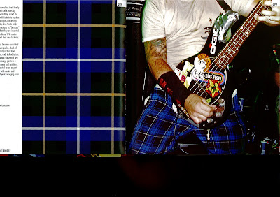
The second chapter tells how squares may act as identifications. I can understand the reason why the authors use ‘Membership and Identity’ as the title of this chapter, as the examples are all considered to be a symbol of a culture, as tartans to Scottish. But the contents are not well organized as I don’t think the squares used in national flags and Date Plaques have any similarity in their functions.

The rest of book actually talks about various usages of squares and checks, though the contents are divided into several chapters of different functions. But there are many interesting examples, including Mondrian style, Pixels style, which we always enjoy but never understand clearly.

The huge amount of pictures are not easy to collect, I appreciate the authors’ work though some part of the book seems only to be used to make up the number.
Contents Page

Squares used in Fashion


Scottish Style

Piet Mondrian Style
Grids

Friday, September 17, 2010

[MAGAZINE] Party (獨唱團)

Mr Han Han, Editor in Chief
A butterfly can cause a gust of wind, a soldier can start a war, a magazine may not do anything, but art is the fish that you need to spend a lifetime to catch. The ‘Solo Group’ is finally coming, and everything has just been started. Each of you is an irreplaceable voice of ‘Solo Group’, and the true world is the world that you have looked through by yourselves.
------Han Han, Editor in Chief of ‘Party’ (‘Solo Group’)

Though the magazine does have an official English name, Party, I would like to translate it directly to ’the Solo Group’, which is an interesting contradiction. Maybe the editor wanted his audience to define the world on their own. This magazine is not about fashion or motors, which are usually the best sellers. It is only a magazine of literature and art.


a Poster of the Magazine

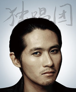
Han Han, a professional auto racer, author, as well as a social commentator, works as the editor in chief of the magazine. As a spiritual leader of Chinese young people, his magazine successfully drew the attention of the entire Chinese society before it is published on July 6th, 2010. I was attracted by the advertising poster of the magazine at first. Using blue and white, the poster simply contains some little symbols of actions, which I think mean that you can live a happier life with the magazine.

The cover design is even more special, from simple to simplest. It is made of Kraft which provides a feeling of old-fashioned. All the words are typed at the bottom of the cover, and are crowded together, forming a dark shape. Once the magazine is put on a bookshelf, it looks so different from any other colorful ones, telling viewers that it is more meaningful.

The magazine is mainly consisted of prose, but some photographs and comics are chosen as well. Anyway, it is worth reading if you really like literature and understand Chinese.


some Pages of the Magazine

[ART WORK] Snowy Mountains (千山飛雪圖) by Cui Ruzhuo (崔如琢)

a Whole View of Snowy Mountains


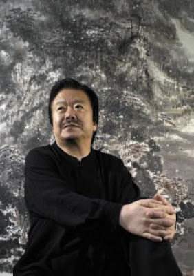
Mr Cui Ruzhuo & his Painting


Chinese painting may not be so wildly accepted, and few artists can earn a global fame. Usually, a piece of Chinese painting will not be auctioned for a surprising price if the artist is alive, but a recent painting broke the record. Snowy Mountains, painted by Cui Ruzhuo in 2005, was auctioned for HKD 13,000,000 (AUD 1,789,307) by the Christie’s in 2006.

Since Snowy Mountains is not a piece of antique, the price mainly reflects the artistic value of the painting. One important reason why it is outstanding is its size. Snowy Mountains is actually a set of 8 pieces of paintings, which can be exhibited both completely and separately. The whole size can reach 1.9m(H)×10.2m(W), which provides a sense of magnificence.

Black and white are not used to make strong contrast in Chinese painting. By using lighter and darker grays, the artist can create a beautiful world within the minimum colors. In Snowy Mountains, the closer mountains are much darker than the further ones, which also contain more details. With simply a Chinese brush, the artist creates lines and shapes, to form trees and stones. The maple trees are emphases of the picture, for they are of dark red. If taking a closer look at the painting, small white dots will be found which stand for snow. It makes the still scene more vital. The special point is that, the picture is about cold and

Snowy Mountains No.1


The whole feeling of the painting is really hard to describe. It is not realistic, and it is not abstract as well. The snowy mountains do not appear on the picture, but in the viewers’ imagination. It is called artistic conception, which is more important than shapes for Chinese painting. Ancient wealthy people spent a lot of time standing in front of such a piece of mater work, feeling the conception the artist wanted to describe. It can calm down people, and make them listen to their own heart.

[DESIGN OBJECT] Ripple Effect Tea Table


It is a piece of latest design by a Korean design group, Jeonghwa Seo & Hanna Chung. It is a very simple tea table at the first sight, but I believe everyone will be shocked when the ripple effect if shown.


a front view of the Table


The visual design of the tea table is good enough, combining wood frames and a black, flat surface together. It can just be a simplified piece of furniture without the support of new technology. The material of the table surface is actually a transparent thin macromolecular material, under which a layer of liquid was stored. Every time you place a cup on the table surface, the liquid layer is affected, and the ripples can be seen speeding up on the surface of the table. As the main color of the table is black, the ripples of water can appear clearly.


the Ripple Effect
 The most special point of this furniture is that, it expresses the meaning of Zen, which means spiritual quiet and harmony. It offers a new feeling of enjoying tea time, sitting face to face at the table, using traditional pottery cups and looking at the ripple on the table. Don’t you think it’s something cool?

Tea Cup & the Table
 This kind of furniture can rarely been seen in shops because they don’t suit the modern style of interior design which is an appreciated by the majority of user. But for some Asians, the Ripple Effect Tea Table is what they have been searching for years. I like it very much because it reminds me of the traditional culture which my grandfather and father have enjoyed.


To see more information about the table, visit http://www.hannaseo.com/

Thursday, September 16, 2010

[WEBSITE] Breathingearth.net

 www.breathingearth.net

Interface of Breathingearth.net 
 
When talking about an IT product, creativity is always something that considered of great importance, especially for websites. Some websites are very functional or informational and don’t need a too special structure. But for websites aiming at attracting viewers, innovation is always something worth trying.

Breathingearth.net is an environmental protection website which warns people the serious problem of unlimited CO2 emitting. Also, it shows the cruel rule of life by listing some statistics of birth and death of the world. The cool thing is, every number is changing from time to time.


The interface of the website is simply a map of the whole world. When your mouse float over a country (even if it is a tiny island country), some numbers will be shown at the left-bottom corner of the map, including population, birth/death rate, and CO2 emitting rate. At the right-bottom corner, some other numbers tell how many people are born/died and how many tons of CO2 have been emitted since you started viewing this page.

Left Corner


The website uses a simple way to show the birth/death rate of each country. When someone died, a black hole appears in his country, and when someone was born, a sun appears. The best part of the Flash system is that, the background sound works well with the changing of the map. By listening to the repeated sounds, you can feel the speed of life.
Right Corner

I really like the simple website, though I seldom care about the CO2 statistics which the website mainly wants to show. What I love is watching those suns and black holes flashing on the map, and noticing the number of new and lost lives. Someday I will also become a black hole, shining once on your screen.